看文档介绍了那么多,最终还是要落实到实战上面。所以还是准备写一个东西出来比较好,一步一步踩着坑才有意思
导航
我选用导航栏在下面的那种,查看文档后发现,可以直接在app.json里面配置
|
|
我在这一步之前,我先新建了两个页面
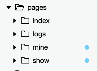
其中tabBar属性就是导航栏的配置
list: [ ] 这里面装的就是导航,最少2个,最多5个
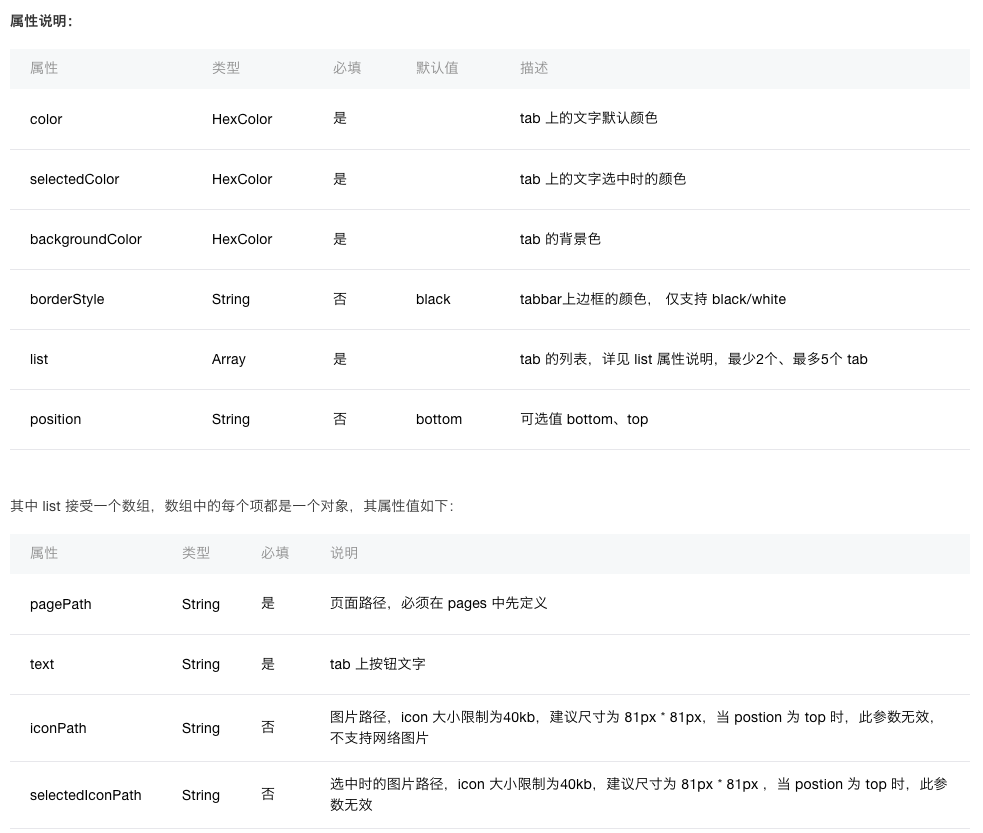
根据官方给出的api,我们来改变一下字体颜色,背景颜色,选中颜色,再添加上图片
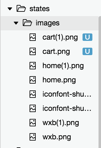
我在网上去找了一些图标,添加进了项目里面
最后的app.json配置如下
|
|
首页
接下来完成首页内容
swiper
首页的第一个内容,当然要是banner咯!
找到文档中的swiper组件,根据给出来的api进行使用
index.wxml
|
|
index.js
|
|
其中踩到一个坑,就是图片的宽度并没有占满<swiper-item>标签,并且图片明显被拉长了,并不是原始比例,给image添加一个class,然后写一个width: 100%;就行了
其实我更新把banner这个改成组件,那么就动手吧
首先新建了一个用来装组件的文件夹,然后下面新建组件banner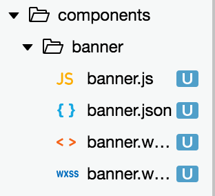
然后把刚才的内容复制过来
banner.wxml
|
|
banner.js
|
|
因为是定义的组件,所以要在banner.json中去确定这是一个组件banner.json
|
|
其中properties字段是获取传递的数据,然后定义一下它的数据类型。我写的是简写,更多可以去查看自定义组件文档
接下来就是我刚才采坑的地方,官方文档中说道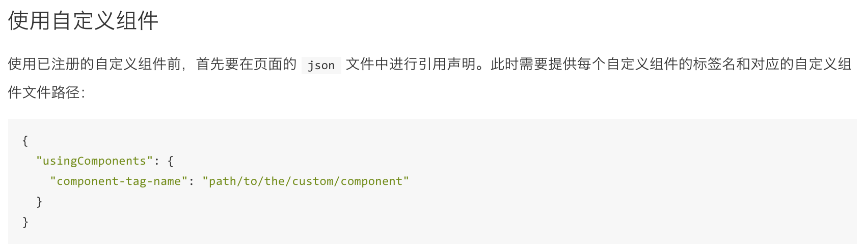
我一直以为是在banner.json中去定义usingComponents字段,后来查询后才发现,应该是在需要引用的那个页面的xx.json文件中去定义。相当于vue中去定义一个组件的名字和路径
所以在index/文件夹下面新建一个文件index.json
|
|
然后在index.wxml中写到
|
|
来看一下成果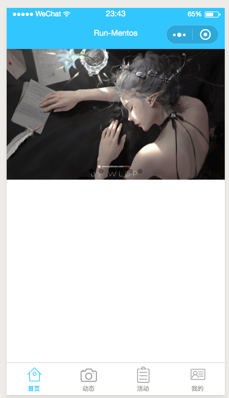
模板
接下来就是首页剩下的部分了,因为我想的是有动态和活动这两个板块,所以决定在这里加上一个火热的动态和热门活动
嗯,想好了就直接动手就行了
因为接下来的两个板块,他们的头部信息都是一样的,所以还是当做模板来做比较好,先新建一个模板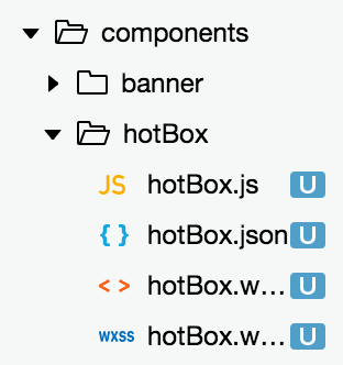
然后照着之前的写法,去把这个模板加进去index.wxml
|
|
hotBox.wxml
|
|
hotBox.wxss
|
|
hotBox.js
|
|
接下来就是里面内容的布局了,照样的还是用模板来做
后面的代码我准备直接上传github,就不在这里写了。在下面一篇文章里面,我会列出我猜到的坑和解决方法